Industry Insights
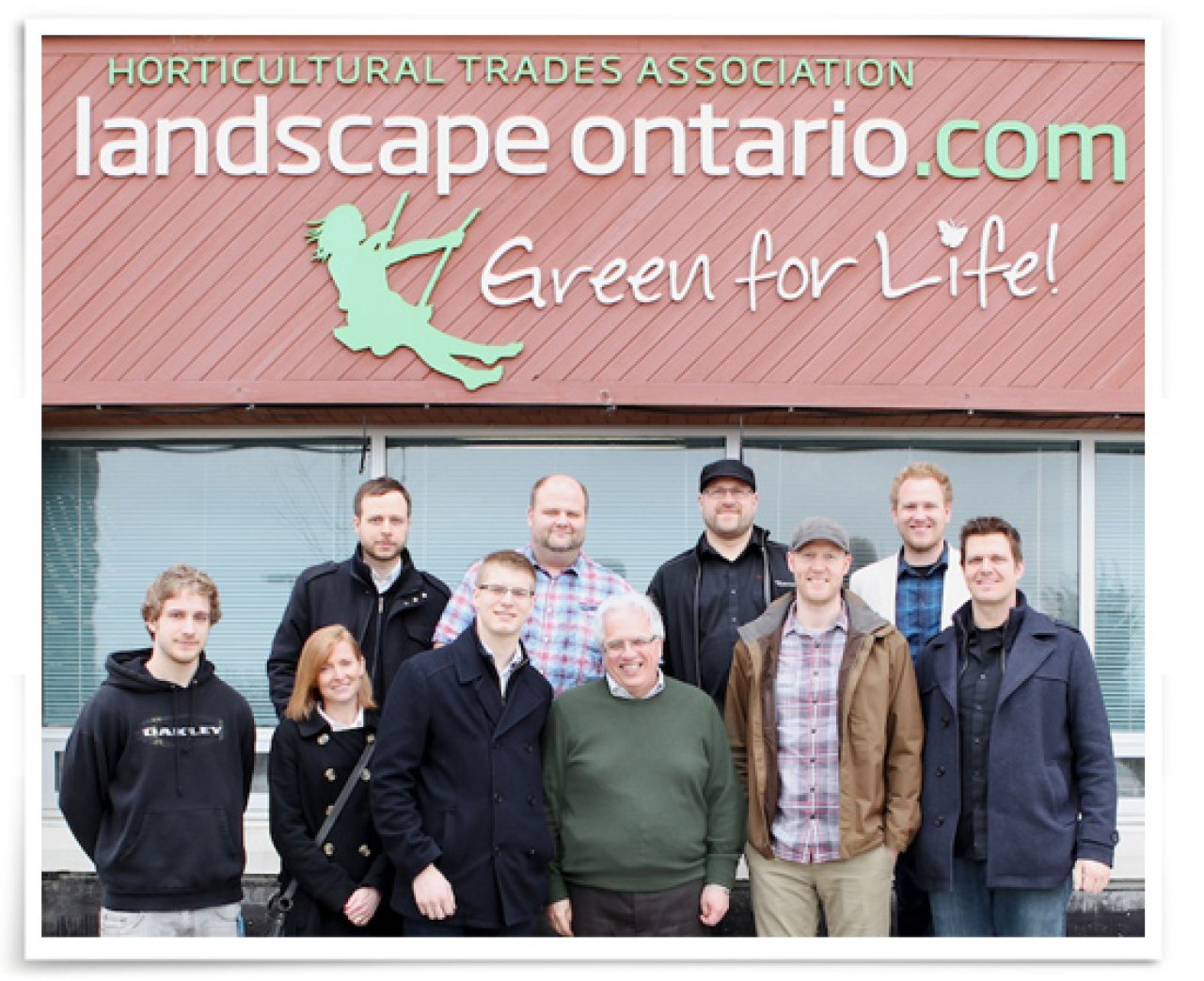
Outing to Type Directors Club
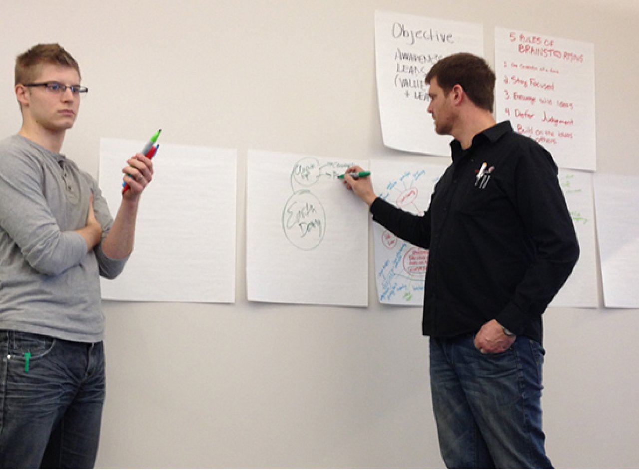
It was a dark and stormy… mid-morning. At 11am last Friday, we lost all power at the Compass office. Luckily for a few of us, we had already planned on spending the next few hours at the Type Directors Club Exhibition at Humber College. The Type Directors Club has been promoting excellence in typography for over 65 years. This year there was a total of over 2000 entries, from 37 countries, from which 215, from 17 countries, were selected.
This was our first time attending a Type Director’s Club Exhibition so we didn’t quite know what to expect. Wouldn’t a typography exhibition consist of large pieces of white paper with black type specimens? Fonts would be displayed in a very scientific manner. Type nerds in tweed jackets would be standing inches away from an ampersand, wide-eyed, leaving puddles of drool on the floor.
When we arrived at the Humber College campus, I think we were all a little surprised by the modest, dimly lit room. Sizing in at no more than 45 by 60 feet, the room was tightly packed with a large array of pieces displayed on folding dividers. Only a few raw typeface specimens were presented. Most pieces were actually finished artwork.
A major theme in our discussions revolved around hierarchy in type. We studied how designers had chosen to treat different pieces of information, working with weight, size, position and even capitalization to convey meaning with different content.
A lot of modern pieces pulled inspiration from older and different cultures. Seeing how the historical is worked into a modern aesthetic is always interesting. From Mexican to European influences, this show reminded us of the importance of playing with ideas and really pushing them outside the typical comfort zone. Working within a conventional, time-tested range is certainly easier, more time efficient and safer, but if we don’t stretch that box larger, our clients won’t benefit, or think to go there themselves.
The finish can make it
It was exciting to have work that is typically only seen on a screen physically in our hands. The most striking impression was how tactile finishes can often make a piece. So often great design is executed with mediocre production values – affordable and cheap output – which is unfortunate. The most memorable projects from the show were the ones that had the extra finishes that just made sense. From unique paper stock, to embossing and die-cuts, to unique stitching. It was an unexpected delight that you don’t often get treated to.
We left with our heads full of inspiration and our typography chops a little sharper. This modest room at the Humber College campus in Toronto packed a lot of punch.
Post co-authored by Nick Tenhage
November 15, 2013