Industry Insights
Mission Aviation Fellowship’s new graphic identity takes flight around the globe
![]()
Early this morning, Mission Aviation Fellowship offices around the world started releasing images of their new logo. This is an exciting day for us as it marks the end of an extensive design process and the start of a fresh new brand identity for an outstanding organization “at the forefront of a global effort to overcome barriers of poverty, ignorance, and disease.”
The MAF story
MAF was founded in the mid-1940s by three World War II pilots who had the vision to use planes for humanitarian ends. Specifically, they sought to use light aircraft to reach the world’s most isolated people and inhospitable locations with essential aid and spiritual sustenance. Today MAF operates 142 aircraft, flying in and out of some 2,500 landing strips in over 30 countries to reach tens of thousands of people for whom flying is not a luxury but a lifeline.
MAF’s story is one of trailblazing heroes, and includes the work of Nate Saint and his four missionary friends who were murdered while trying to reach out to the Huaorani tribe in Ecuador in 1956. Long before the movie “End of the Spear” was released, I remember being spellbound as a child by the stories told by missionaries and MAF pilots at school presentations.

Every three minutes, an MAF aircraft takes off or lands, reaching isolated places where flying is not a luxury, but a lifeline.
One mission, one logo
From the beginning, the organizations known around the world as MAF have shared a common name and mission. However, they did not share a common logo which created identity confusion, complicated the sharing of resources, and effectively diluted the impact of the MAF brand. With our help, the MAF Global Family decided to work together to develop a single logo symbolic of their unity and common purpose.
The new logo design centres around the themes of Aviation, Technology and the Spirit of Christian Love. Its overall look positions MAF as a leading professional organization that is poised for the future.
The cleverly integrated icon of the dove is a traditional Christian symbol and has been a key element in the graphic identity of a number of MAF groups over the years. An appropriate symbol to represent an organization focused on aviation, the new dove pays homage to the organization’s rich history, and yet has evolved to better reflect what MAF has become and where it is going.
Other design features of MAF’s new logo:
- Highly visible uppercase letters ensure legibility from a distance.
- Solid line weights reflect confidence, steadfastness and professionalism.
- The swoosh conveys activity and forward motion.
- The bold shapes and bold colours are arresting.
- Red reflects passion; blue evokes professionalism, safety and trustworthiness; gray tells of practical and technical expertise.
The result is a striking, appealing graphic that is iconic, unique and memorable. It embodies a professional, credible, active, diverse and highly capable organization.
Should not all MAF groups have access to newer printing technology, a potential concern in many regions, the logo can easily be reproduced by rudimentary processes such as stencil and spray paint.
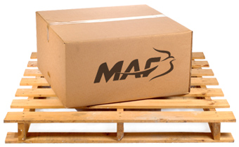
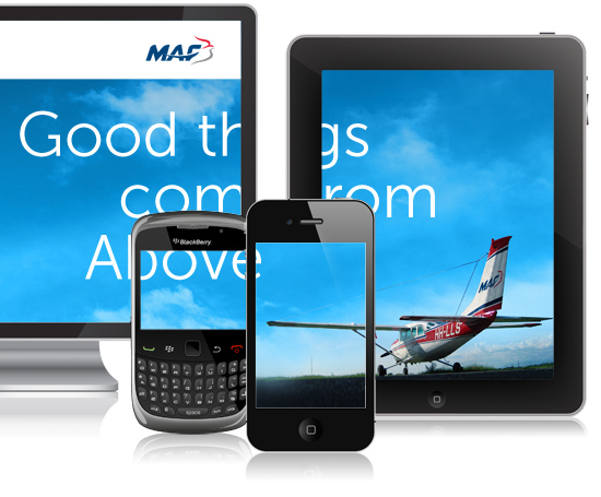
The logo will be put to work in many different environments and many different mediums to help raise awareness and promote the organization. The new design is versatile and functional across multiple publishing platforms.
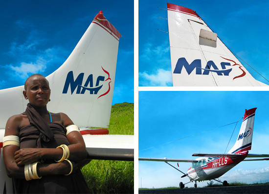
Of course the most important place the logo will appear is on the tail of the MAF Aircraft. Seeing the arrival of an MAF plane is a very significant event for thousands of people every year, because seeing a doctor, getting a Bible or having adequate food and clean water, may only happen when an MAF plane arrives.
The MAF logo was one of the most challenging design projects we’ve ever had the privilege to be a part of. We congratulate the MAF Global Family on this milestone, on achieving greater cooperation and collaboration internationally and on the ongoing work that they do. It is a symbol to be proud of. Personally, I take great satisfaction in our team’s contribution to the visual history of an organization that captured my imagination as a young boy and which has been dear to my heart ever since.
Written by Jason Bouwman, RGD
August 15, 2012