Industry Insights
Is your website responsive?
When Henry Ford invented the automobile, it had a different name. It was first dubbed the “horseless carriage.” The contraption was so new and so foreign that people resorted to describing it using terms which were more familiar.
Communication challenges like the one Henry Ford faced still abound today, particularly in the rapidly developing world of Internet technology and online marketing.
The current challenge re-shaping the world of online marketing is the onslaught of different devices that enable users to access the Internet from wherever they happen to be. Some have said that within the next 1–2 years, over 50% of people accessing the Internet will be doing so via these devices. But what exactly do you call a computer that you hold in your hand? A phone? A computer? A tablet? A “mobile device” seems to fit, for now, but the question then becomes, how do you serve up a website that works for all of them?
In an attempt to address the problem, there has been a proliferation of the concept of a “mobile web.” Because it’s difficult to view traditional “desktop websites” on much smaller screens like the iPhone, many have opted to create separate “mobile websites.” These websites are stripped down versions of the main, traditional site, serving up an inferior version. They tend to work only on specific devices (the popular ones currently on the market) and are then classified as “mobile friendly.” This is confusing the matter, leading people to believe that the web has changed and that there is a new “mobile web.”
But…
“There is no mobile web.”
This is the bold assertion made by Jeremy Keith in his video which brought us clarity and cemented our understanding of the mobile challenge.
“There is no mobile web.”
Just the web.
And consumers want full access to a full site no matter what device they choose to access it from.
When you consider the vast array of devices that exist and that can be held in different orientations (vertically, horizontally), you can appreciate the challenge this poses for designers and developers. It’s increasingly difficult to present a consistent experience on multiple screen sizes. Print design stands on over 100 years of principles and knowledge on how to effectively design for the fixed medium. We are used to having control of the space we are designing for. Designing for the web is a new world and it’s changing daily.
We can no longer simply take a design for print and put it on the web. That approach is being shattered as sales of mobile devices skyrocket. A new approach is needed which is leading to the emergence of something called “responsive design.”
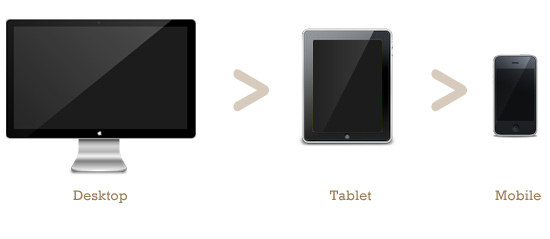
Old way to design:
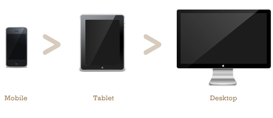
New way to design:
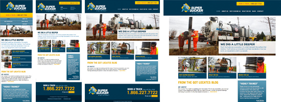
Responsive website design brings a whole new level of complexity to the process and requires more strategic thinking before diving into the design or programming. We must tackle websites knowing that there are no longer fixed sizes. Instead of designing 5 different sites for different devices, we must design one that works on all devices.
Still confused about what we mean?
To try it out for yourself, visit the links below on your different devices OR open them on your desktop computer and then resize your browser window to see how the site responds and adapts to the changing size of the window.


Also see:
It wasn’t too long ago that many organizations finally accepted that the Internet was actually here to stay. The next realization will be that they can’t control which device their audience uses to access their content. At that point they’ll need to reconcile their design approach with this new reality.
How far to take this approach will require deeper insight into their market and informed strategic thinking. But then, good design and marketing always has.

Written by Jason Bouwman, RGD
June 13, 2012