Industry Insights
5 logos. 7 professionals. 10 wrong answers.

This past Friday our team had the opportunity to participate in a special lunch and learn activity, hailed by a many as “the most fun we’ve ever had [in our lives].”
So, what did we do that was so much fun?
We split into 2 teams and each was asked to draw 5 iconic logos from memory. While one team was able to recall 2 logos semi-accurately, no team was able to remember the exact details of most logos. Why is that?
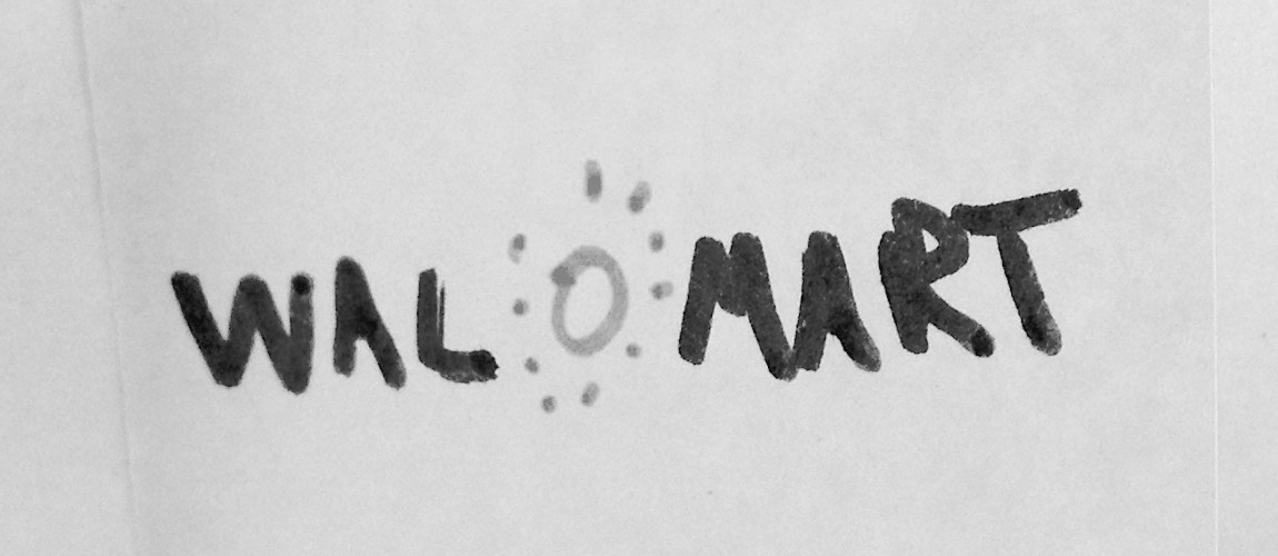
Before getting into details, I must give credit where credit is due. All teams were very good at recalling brand colors, but shapes and elements were harder to remember. We also learned that when brands that have evolved over time, people confuse elements of new and old identities (like Walmart!).
What do we do with this information?
Most of us would default to assuming the more simple the logo the better, but that’s not necessarily true. Let’s compare Starbucks and Target. Starbucks has a very detailed illustrated logo — and while a study concluded most people can’t remember the intricacies of the logo, the essence of it was remembered (A mermaid in a circle, in green). Target’s logo was more accurately remembered but despite the simplicity, 41% of people didn’t get the number of circles right, and 21% thought the wordmark was black.
If the simplicity of the logo isn’t the most important factor, then what is?
The entire brand system, consistently executed, combined with exposure. Just like our minds use our smartphones as crutches to remember details such as phone numbers, our minds don’t bother to remember the intricacy of visual identities — instead, they rely on their wide exposure, assuming the brand will be consistent wherever it appears. The essence of brands is so ingrained in our minds, that most people will associate a green circle to Starbucks, a blue square with Gap and a red triangle with Canadian Tire.
Now, I’ll turn to Sherlock Holmes and a study to answer the burning question of why a bunch of bright young folks forgot what these logos look like.
How can logos from companies like Apple, Starbucks, and Canadian Tire be so hard to remember?
A recent study concludes:
One explanation is that, as Sherlock Holmes said, we “see, but do not observe.” Logos of giant corporations are so widespread that we don’t need to have a photographic memory of them to recognize and engage with these brands. Instead, we remember just enough to get by. This process has been dubbed “inattentional amnesia” – despite seeing something many times, we fail to create a lasting memory of it. We found this to be the case even when participants engaged with the brands more than average.

Written by Diego Lopez, RGD
October 23, 2017